
The latest app icon change from Spotify has stirred strong reactions across social platforms. The familiar bright green circle now appears as a glossy emerald disco ball with a faint outer glow. The shift, tied to the company’s 20th anniversary, has created confusion at first glance, with many users interpreting it as a low-quality or unofficial version of the original logo.
Despite the criticism, the design carries a clear intent. It signals a temporary visual update meant to spotlight anniversary content inside the app.
The reaction online turned immediate. Posts on X highlighted frustration, confusion, and humor around the new icon. Some users described it as a “blurry” take on the classic logo, while others questioned whether it was a glitch or imitation.
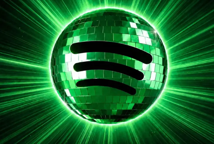
The response from Spotify on X directly addressed the conversation, confirming the change was intentional and not permanent. The company clarified that the disco ball icon was introduced specifically for the 20th anniversary celebration.
While the design divided opinion, it achieved high visibility within hours of release.
Inside Spotify’s 20th Anniversary Experience
Alongside the icon update, Spotify introduced a dedicated in-app experience centered on its 20-year milestone. The feature highlights early listening history, frequently played tracks, and long-term streaming patterns, structured in a style similar to Spotify Wrapped.
This experience connects users with their streaming habits over time, resurfacing older tracks and personal listening trends. The idea focuses on memory recall through music, creating a timeline of activity inside the platform.
Spotify has long used Wrapped as a cultural touchpoint. The anniversary version follows the same structure, designed to encourage users to revisit their listening history and engage with platform data in a more personal format.
The company was founded in 2006 in Sweden and later expanded to the United States in 2011, making the 20-year framing more symbolic than literal for many users.
Why Logo Changes Trigger Reactions
Brand identity updates often spark immediate debate, especially when tied to widely recognized visuals. Similar reactions have appeared in past redesigns across major companies.
Examples include the brief redesign phase from Gap, the abstract visual shift from Airbnb, and broader rebranding efforts from Jaguar. Even seasonal redesign discussions around Cracker Barrel show how quickly audiences react when familiar visuals change.
These reactions tend to follow a familiar pattern. Initial confusion often turns into adjustment, and over time older designs can start to feel outdated compared to newer ones.
The disco ball icon sparked strong attention and drove users toward Spotify’s 20th anniversary features. It encouraged app opens and exploration of retrospective listening data tied to long-term usage.
Rather than serving as a permanent redesign, the change acted as a short-term visual cue guiding users toward in-app anniversary content.
Overall, the temporary icon created wide discussion while successfully highlighting Spotify’s milestone features and showing how familiar branding shifts can quickly capture user interest.